

American Family is the 12th largest casualty insurance group, servicing over 14 million policies in 19 states.
Story: Improve American Family’s My Account dashboard
Role: Led User Experience for American Family Insurance's billing and payments team.
Scrum team:
• Product Manager
• Product Owner
• UX Designer
• Android Developer
• iOS Developer
• Web Developers (2)
• Analytics Specialist
Responsibility: Research, prototyping, and designing the My Account dashboard for mobile and web users using Figma.
Problem: The customer dashboard was split into billing and policy sections. This separation was illogical because payments are what keep policies active. It also led to duplication and confusion.
In addition, the UI failed to educate customers that they could have multiple billing accounts containing multiple policies, leading to increased call center support calls.
Before: Billing accounts didn't convey customers could have multiple bills covering various policy groups.
Most American Family customers have around three policies and prefer to use desktops for account access.
UX/UI Goals: Educate customers and reduce billing/policy confusion.
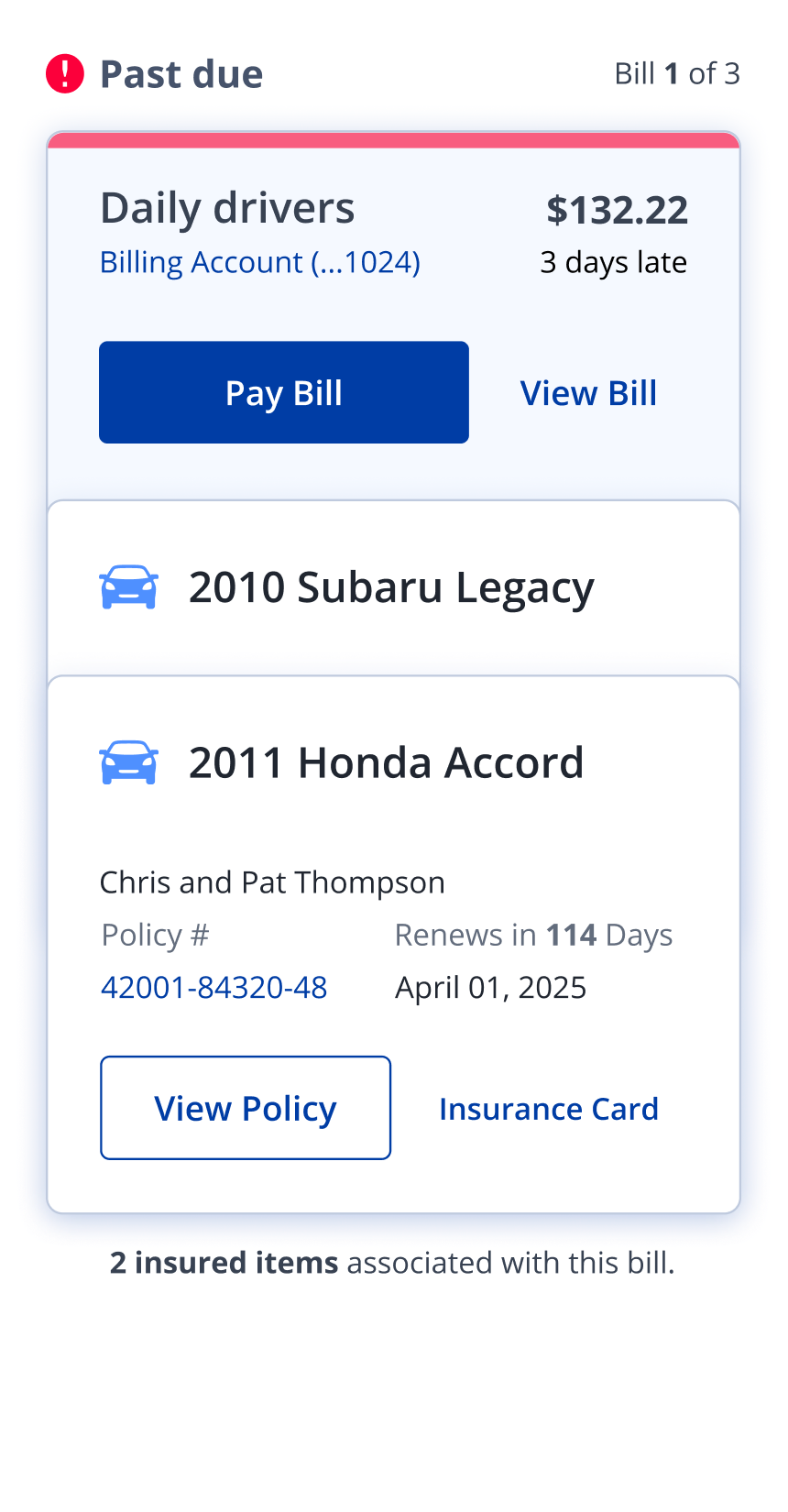
Merge billing & policy information, Combine billing and policy information to clarify their relationship and avoid customer confusion.
Relocate essential information, place essential information and frequently requested items at the top to improve user convenience.
Improve context, and clearly show customers what they owe, what's due now, and what's coming up.
Product agreed we merge billing and policy sections on the dashboard, to move essential information above the fold.
Challenge: Due to AmFam's liability, Customer-facing UX designers were prohibited from interviewing customers.
Instead, I listened to calls and interviewed support reps to validate my assumptions.
UX Research: Because billing and policies were shown separately, customers didn't realize they could have different bills for different sets of policies. Each bill and policy had an account number, making things even more complex.
Solution: We resolved customer confusion by integrating e-commerce design patterns. UX research confirmed this, as customers quickly grasped the edit cart-style prototype, proving the solution's effectiveness in simplifying the payment flow and increasing overall understanding.
New insurance dashboard (mobile)
New insurance dashboard (web)
After: Improved bill/policy connection
Impact: The improvements made it easier for customers to understand how their bills and policies worked together, and they felt more confident.
★ Clearer bill/policy connections
★ Less billing confusion
★ Quick view: due dates & next steps
★ Easy access to everyday actions
★ Essential info relocated above the fold


