




Decore is the US's second largest cabinet door manufacturer.
Role and Team: The team operated onsite out of Decore’s IT headquarters based in Monrovia, California, coordinating between seven production facilities responsible for manufacturing select kitchen cabinet components.
I provided UX Research and UI Design for their iOS mobile and responsive web apps.
• Product Manager
• Product Owner
• UX/UI Designer
• Web Developers (2)
• iOS Developer
• Canvas 3D Animator
• Illustrator
Description: Redesign Decore’s Streamline™ kitchen cabinet ordering system to reduce confusion and time to complete.
Problem: Specifying and ordering Kitchen cabinets is a highly complex process.
For example, selecting cabinet boxes, a critical task, was confusing for contractors and customers, significantly slowing down the flow and resulting in incorrect orders.
UX Research: Interviewed contractors and customers. Most knew what they wanted to order but were getting lost translating their specific needs using the previous UI.
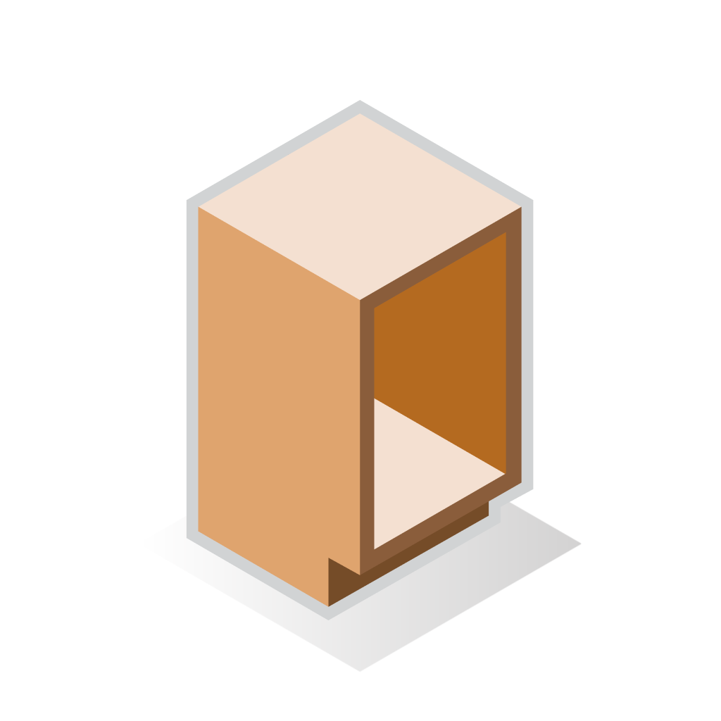
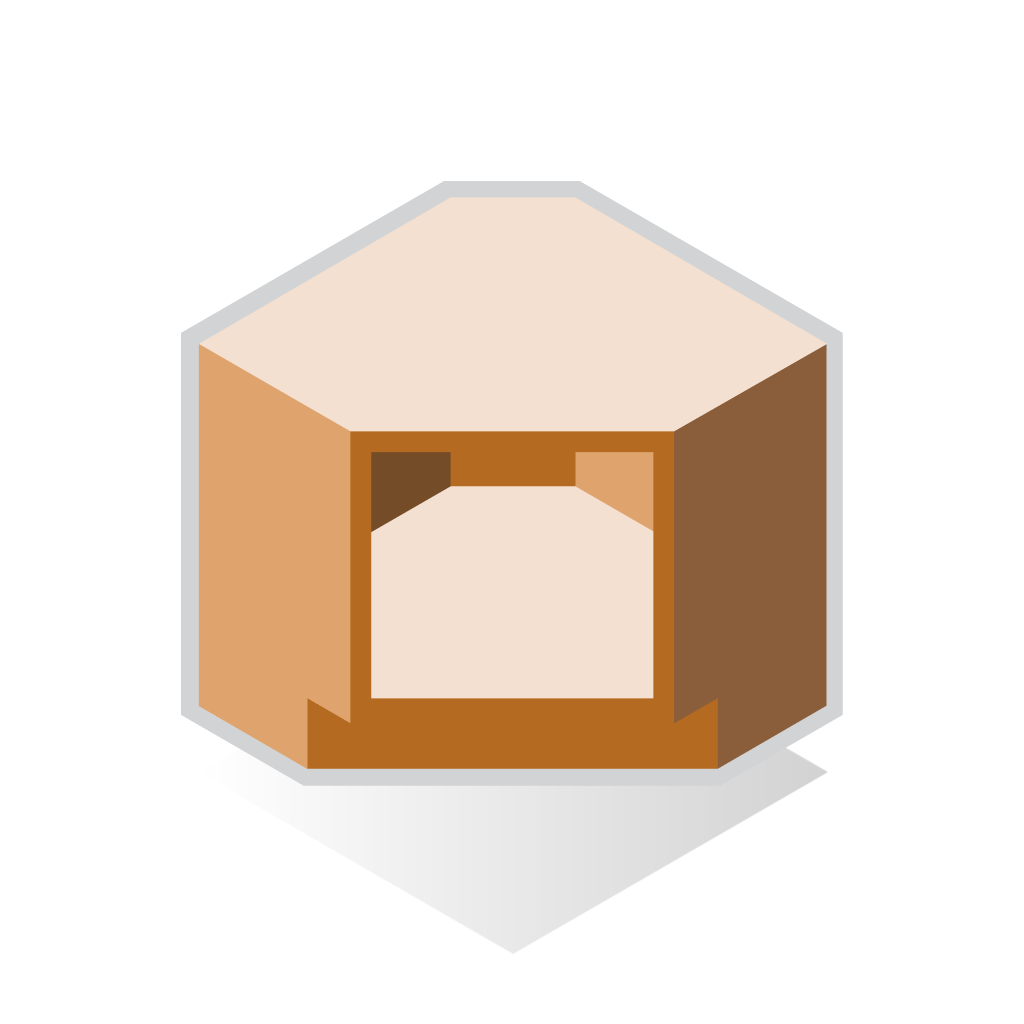
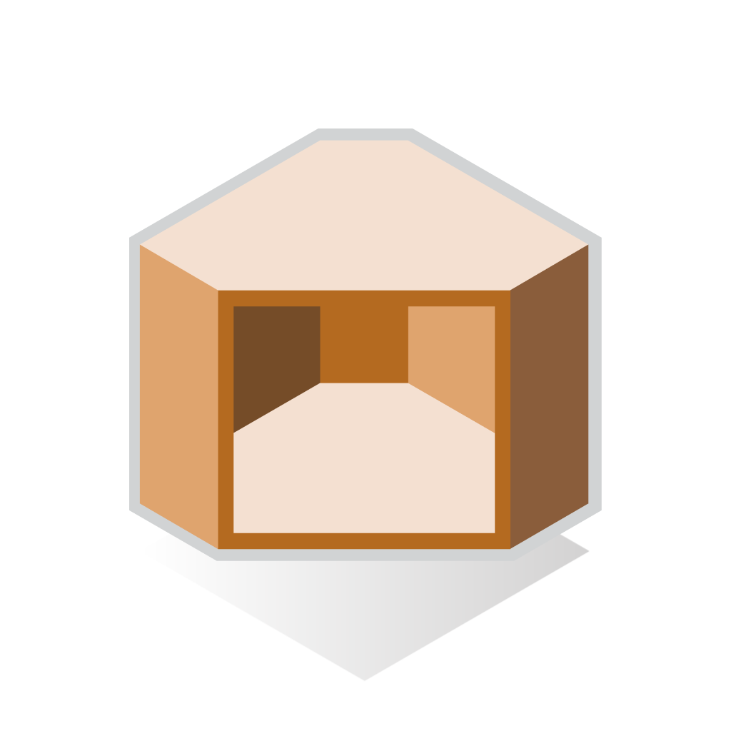
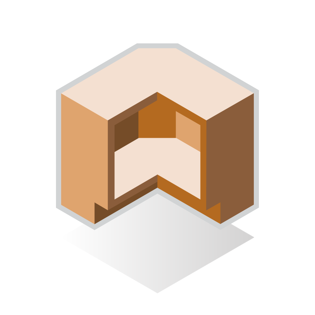
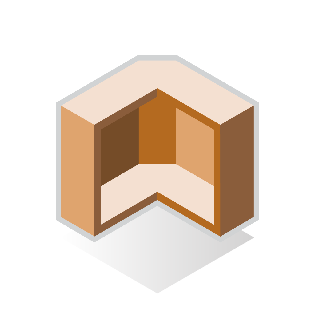
Customers struggled with text-based menus, having to read every item before selecting. To solve this, I designed visual dropdown menus with clear isometric icons.
Isometric icons were crafted to describe each cabinet and clarify the menu visually. This made it easier for contractors and their customers to confidently proceed to the next step. The new icon menu was easier to use, speeding up the ordering process.


